
Seldom has the hype surrounding a Google update been so feverish as was the case with the infamous mobile-friendly update. Let me set the scene. Once upon time, back in early April, the mighty Google decreed that sites that do not pass its new mobile-friendly test shall be banished from its mobile kingdom, ahem, rankings, with immediate effect. The SEO nobility were scared. Some began to speak of what eventually became known as Mobilegeddon.

The Tale of “Mobilegeddon”
The stage is set. Curtain up. How did this drama play out? Did the SEO knights vanquish the mighty Google? Over the last few months we have been busy collecting data for the winter. Our brand new study chronicles our quest to answer not only these questions, but to gain insights into how to optimize pages for mobile search.
Check out Mobile Ranking Factors 2015
Mobilegeddon descends: to the victors the spoils
Shortly after that dreaded day in April arrived, we tallied up the victors and the wounded. We found conclusively that websites that were not optimized for mobile devices and/or did not pass the mobile-friendly test (available here) did not fare well.
A quick look in the noble Searchmetrics Suite shows us that while desktop visibility of the wounded stood strong, mobile visibility suffered heavy losses.
1. Loser Example: boxxofficemojo.com

But some sites never learn. To this very day the page remains in mobile exile (non mobile-friendly). When looking at the screen display across devices, this becomes even clearer:

The Google test lists the following misdemeanors:
- Text is too small and hard for mobile users to read
- The links are too close together and hard for digits to navigate
- Mobile display area has not been set
- Content is wider than the screen
What of the victors? The triumphant victors not only survived this update they benefitted. Sites that passed the test (with a mobile version of their site, with responsive design, or with dynamic serving) kept both Google and its mobile subjects happy. Another glance at the Searchmetrics Suite illustrates this:
2. Winner Example: newsweek.com
 You guessed it, this page passes the Google mobile-friendly test. And looking at the design per device, the content is well displayed across all screen sizes.

But why is it so important to be mobile friendly?
This is a valid question. Just because Google carries out an update does not necessarily mean that we have to bend to its will. But as we have discovered in our constant quest for insights and data, the arguments for adapting and becoming mobile-friendly easily outweigh the arguments against.
The voice of mobile is getting louder by the day

Mobile search is growing all the time. In the US, and according to their own data, more Google searches are now carried out on mobile devices than on desktop. Reason enough to optimize for mobile devices. Of course this does not necessarily mean that all of these extra searches result in conversions.
User Experience in three acts
We all want to offer our users the best possible online experience. The rise of mobile now means that a customer may research a product on the way home from work on a mobile device, then buy it on the laptop after getting home. User journeys are more complex and often involve multiple phases across multiple devices. Can you still really afford to ignore mobile devices? (No.)
Source: Statcounter
Ok. Sound’s good. Can I return from mobile exile?
Sites are learning. Our data show that before the mobile-friendly update 80% of the top 100 US domains (by SEO visibility) were mobile friendly, i.e. they passed the test. We checked this again in September and found that 90% of sites in the top 100 to be mobile-friendly.

This 10% increase is explained by an increasing number of sites’ decision to go mobile-friendly. Suite data shows this often resulted in an increase in mobile visibility, with some sites even fighting their way back to pre-update levels of mobile visibility. All omens indicate that this trend is set to continue.
Mobile really is the future of online search. So to get back to the question: yes you can. And you should really consider it, as this can help maximize online visibility, brand awareness and revenue.
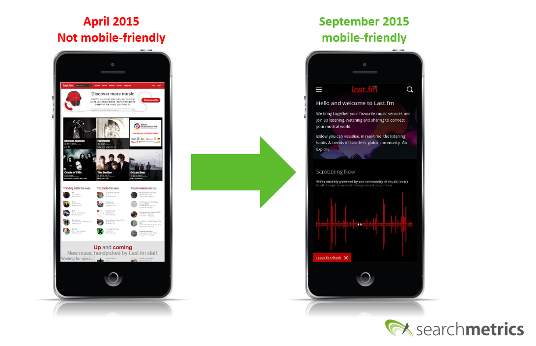
3. Recovery Example: last.fm
The domain last.fm was not mobile-friendly when the Google Mobile Update happenend, and the impact on their mobile visibility is clear.

Since they have gone mobile-friendly and now pass the test. As a result the mobile visiblity of the site has recovered. We can seen this improvement below:
Other domains, like reddit.com, solved the problem by creating a separate mobile URL (in this case m.reddit.com), which helped their mobile visibility to recover from organic ranking losses in the wake of Mobilegeddon.
Got it. So I need a dedicated mobile strategy, right?
Exactly. Want to see what happened to the main character? Of course you do. Check how you were affected by Mobilegeddon in the mobile research area of the Searchmetrics Suite.
Learn More About Searchmetrics Mobile Research
Here you can see how you rank for specific keywords and importantly whether there is a difference between your desktop and mobile visibility. You can also see which content to optimize to maximize your traffic.
Important note: the algorithm behind the Google Mobile Update is page and not domain specific. If your homepage is optimized for mobile, but other pages are not, Google knows this. It’s opinion of your site is revised with every crawl.
Defend your online presence: Choose your weapon
What is a ranking factor? We get asked this question a lot. By analyzing billions of data points over time (and with plenty of magic behind the scenes), we are able to identify something we believe is closely tied to Google rankings: ranking factors. A quick example: page load time. Can the time a page loads really affect your ranking? Well according to our data, yes it can.
Example: on average, pages ranking in the top ten load up to 0.2 seconds faster than pages being that ranked 20 positions lower.
Ranking factors are your arsenal to fight your way up the rankings. Knowing, understanding and optimizing your presence can drive your approach to online marketing and boost your rankings.
Knowledge is data. Data is justification to implement change.
Learning to adopt a data-driven approach means not reacting to changes in opinion. It means reacting to changes in the data. We have already shown that for non mobile-friendly sites online visibility sharply and continually decreased after the mobile update, losing traffic and online revenue.
Check out our Mobile Ranking Factors 2015
In a fast moving online market place, strategic decisions inherently involve time and money and need to be justified. Searchmetrics encourages reacting to the latest data analysis and optimizing content and websites to meet modern standards. Read our new study to learn much more about mobile search, get an insight into what conclusions can be drawn from the latest data available and create a dedicated mobile strategy for your business.
And finally, make sure you check out our new mobile fact sheet for some more great insights into mobile search.
If you have any comments or opinions you would like to share, let us know below.