Like a train pulling out of a station, Google’s long-awaited mobile-first initiative represents a journey to new places. After the confirmation of the rollout on March 26 2018, it took a while for things to really get moving, but in September 2018, mobile-first started to pick up the pace, as Google sent out a wave of emails confirming the enablement of mobile-first indexing for huge numbers of domains. What will this mean for pages that are still optimized primarily for desktop computers? In a special installment of Unwrapping the Secrets of SEO, we’ll tell you what you need to do now to wield power in this new era of search.

Don’t Kick the Can Down the Road
If your industry niche is desktop-dominated, you may feel tempted to ignore Google’s move to mobile-first. That would be unwise. In a previous post, we walked through how to prepare for mobile-first .
From March 2018, the old status quo had gone. The switch to mobile-first indexing isn’t happening all at once, but you won’t know when it happens to you until it does. Google always said it would notify site owners when their sites had migrated to mobile-first in a message on Search Console. After that, they’d see increased crawl rates from Smartphone Googlebot and their mobile pages on Google’s Cached Pages.
Winds of Change
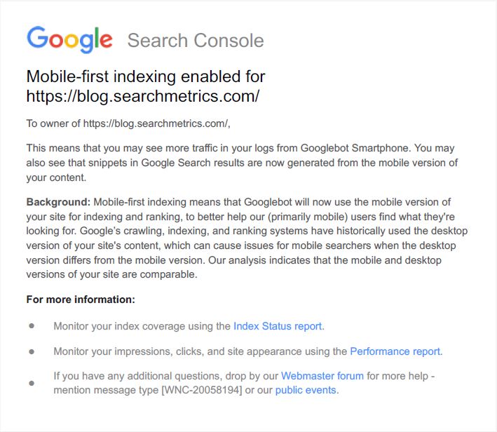
After the intial March excitement had subsided, there was a period of calm with only a few domains receving notifications from Google. People knew mobile-first was coming, and it was even theoretically here, sort of, but the piecemeal rollout made it hard to make any sensible assessment of changes to the search landscape. Gradually, mobile-first drifted off (some) people’s radars. In September 2018, this changed. Webmasters around the world were inundated with vast numbers of emails from the Google Search Console, all with the subject line “Mobile-first indexing enabled for …”. Ours came on the morning of September 20.
SEO agenices, who are responsible for numerous websites, saw their inboxes flooded with emails. This quickly helped fuel the online speculation that this was a significant move by Google, and not just a few isolated cases. Search Engine Land columnist Glenn Gabe tweeted that it was “raining mobile-first indexing emails”, stating that “Google is on a serious push lately”:
It’s raining mobile-first indexing emails! Yet another wave of m-first indexing emails arrived last night and this morning. Google is on a serious push lately. Just a heads-up. 🙂 pic.twitter.com/xXiknDzvL2
— Glenn Gabe (@glenngabe) 19. September 2018
If you’ve received a notification email for your domain (or domains you’re repsonsible for), and you’ve somehow managed to ignore mobile until now, then you don’t need us to tell you it might make sense to start paying closer attention. At the very least, you should put a pin in your tracking and reporting the day you got the email so that you can monitor any subsequent impacts of the switchover on your website performance.
Shifting sands
The good news for mobile overachievers? If you have a responsive site with identical mobile and desktop content, this change should not initially affect you.
The mobile-first index is part of a huge shift at Google, focusing on security, speed, mobile-friendly design, and mobile SEO across all services. The following Google projects are affected:
- Google’s open source project AMP, plus AMP stories, including PWAs.
- Google Chrome and the Polymer project , with implications for Chrome, You Tube, YouTube Gaming and Google Earth.
- Gmail, as shown in this video on what’s next for AMP.
- Google Web Designer and AMPHTML.
- Google AdWords and AMP ads, where the introduction of AMP into ad creation will benefit from the company’s earlier crackdown on ads in Chrome.
- Google Analytics where it overlaps with AdWords and AMP.
- Google Analytics attribution is key to cross-device functionality, and it is now tracking cross-device traffic, integrated into e-commerce.
- Google Shopping and e-commerce
- With AMP, Google is making a bid to dominate the format of, and SERPs in, as seen in its continued influence on the market with Google Shopping dominance in Europe.
- Google Image Search for mobile.
- YouTube videos in mobile search results.
- Blogger and WordPress, the latter of which already is not a Google project but already has AMP implementation.

Focus on the Bigger Picture
Make no mistake: this index launch means you must reevaluate your site for speed, interactivity and embedded applications.
Speed
As a sign of just how much this index launch is related to other considerations, ranking factors in the mobile-first index are changing.
Mobile users scroll quickly and have short attention spans. On Jan. 17, Google announced that page speed will be a new ranking factor on its mobile index, starting in July. And a Searchmetrics analysis found that mobile pages ranking on positions 1 to 5 do tend to load faster than those lower down the SERP.
By using speed as a ranking factor and promising the mobile-first index in the next breath, Google indicated that getting ready for the mobile-first index actually means using AMP, a mobile-only standard that uses HTML5 markup. Nominally open source, it’s very much a Google-led project. If pages are designed with AMP, they upload almost instantly. Google also validates and caches AMP pages.
That’s why Google’s focus on AMP initially shifts the discussion on mobile index-readiness from SEO strategies to website design.
Google is calling for general AMP adoption to create sites that will fare well in its mobile-first indexing. Some brands now have a desktop site, a mobile version with non-AMP elements, and AMP elements or pages in one or both versions.
Despite its pronouncement about non-AMP preference, Google has shown definite interest in implementing AMP across many websites because of the speed in loading times. If not AMP, Google wants AMP-like speed across page designs. While AMP status is flagged in mobile SERPs already, it may be only a matter of time, if AMP is widely adopted, before AMP validation becomes a ranking factor.
Interactivity and Embedded Applications
On a mobile site, fast pre-rendering draws users in; interactivity and embedded apps keep them engaged. While mobile commands more traffic than desktop, it also has a 40% higher bounce rate. The challenge is to get that bounce rate down.
Website Redesign: The BMW Example
BMW.com provides a great example of how upgrading your mobile site for Google’s Mobile-First index can also be an opportunity to create a content marketing platform. BMW rebuilt its site last year with AMP to make it faster and more interactive.
The new mobile optimized site combined four ideas of mobility: driving BMW vehicles; geo-locational movement of mobile devices; mobile users’ fast browsing; and the new dynamism of mobile-friendly sites. That resulted in an immersive marketing campaign that showcased vehicles speeding along in videos. An AMP shadow document triggers the user into more and more content discovery. Content appeared in response to scrolling, and pre-rendering let users interact with in a personalized way with video content.
In the sales funnel, BMW developers found that AMP was important for maintaining awareness, interest, engagement, while PWAs followed up with conversion and retention. Even with these changes, BMW also has issues, as it competes with its other sites that haven’t undergone the process. It bears keeping an eye on to determine what exactly a best practice looks like.
Mobile-First and SEO
Without explaining new ranking factors beyond speed, Google implies that AMP validation will improve your site’s performance in mobile SERPs. AMP’s Top Stories news carousel has been featured in search results since 2016, and AMP pages are now appearing in regular mobile searches, marked with an AMP symbol.
Is this protocol really a sure thing for winning in mobile rankings? Not if your AMP pages have bad code. Since February, if you want AMP pages designated as such, the pages must have content parity with the related canonical page; otherwise Google will ignore your AMP page and revert to your canonical page.
Despite all this talk of AMP, be cautious before you jump in with AMP implementation. Assess your own business needs for site functionality and consider if an AMP redesign will replicate or improve functionalities.
Also consider the decisions and resources required to make the change. AMP has limitations that require extra development time. Consider how many Web properties you want to maintain, and whether you need a responsive or dynamic site, separate mobile/desktop sites, select AMP pages, or an AMP-only mobile site.
And remember that AMP/PWA redesign of your mobile pages requires at least a partial site migration. To maintain or grow Visibility, validate any AMP implementation with the AMP Validator before, during, and after making changes on a mobile site. Prioritize and fix coding errors before going live.
You can audit your site against Google’s standards with Lighthouse and check speed of specific pages with Google’s Page Speed Insights. Other tools are the Mobile-Friendly Test Tool ; the Structured Data Testing Tool; and the AMP Test Tool. Use ngrok tunneling to safely test unpublished material behind your firewall.
Once you get through these development stages, alter your SEO strategy according to crawls of your site conducted before and after changes.

Understanding Google’s End Point
Mobile-first is not simply about writing great content and building pretty, responsive websites to serve mobile users in the best way. Google’s interest lies in perfecting a digital environment where human-machine interaction is natural and immersive.
Google has made big, clear statements that perfecting a mobile-first strategy is a key stepping stone towards creating an AI-first world that will dramatically change the face of both software and hardware.
Life in the cloud begins with ultra-fast navigation, which pulls marketing and SEO into the real world, the real user and the real experience. It’s not just a change in how Google indexes search results. Mobile use, made ultra-efficient by mobile-first search and AMP, is the bridge between the virtual and real and enables a deeper integration of digital interaction and marketing into the physical world.
As one of the biggest search stories of the year continues to unfold, we’ll keep digging into our data to understand how these changes will impact marketers in ways that are predictable and unforeseen.
DISCLAIMER: This post originally appeared on 26th March 2018. It was updated on 20th September 2018 to include the latest information.