
Google is saying goodbye to desktop crawls and will be switching to mobile first indexing for every website from March 2021. This means that Google will be using the mobile version of your landing page for indexing and ranking. For webmasters, SEOs and digital marketers, this means checking upfront whether they are ready for mobile crawling. With 30 % of all sites that rank in Google’s search results still crawled with the desktop Googlebot, however, it would seem that not all websites are up to the task. This blogpost reveals 5 tips to help optimize your site for mobile first indexing.
According to Google, around 70% of all websites that rank in their search results are crawled with the mobile user agent. This means that almost one third of all sites are still crawled with the desktop crawler. This is set to change. Soon the mobile Google Crawler will be sent out to every website, whether it meets mobile requirements or not. To help you get ready, we’ve outlined the implications and the main steps you can take to optimize for mobile first indexing.
Google gave “a little extra time” to prepare
Back in September 2020, Google announced they were switching over to mobile first indexing. Google then moved the final roll-out date to March 2021, a decision that was much welcomed by website operators. There are a number of reasons for this. An official Google blogpost cited teething problems in the test-runs as well as general uncertainty in the wake of the Covid-19 pandemic.
If you’re not quite prepared, our tips on how to get your website ready for mobile first Indexing will help!
Mobile Indexing #1: Analyze Google crawling and errors
Which crawler does Google use for your website – its desktop Googlebot or mobile smartphone user agent? In other words, does Google consider your URL to be mobile-friendly?
Webmasters can use the Google Search Console to check the “user friendliness on mobile devices” to see which crawler is visiting your website. This is a quick and easy way for you to view a list of all the URLs in the Google index as well as any errors, e.g. “content wider than screen” or “clickable elements too close together”.
Mobile Indexing #2: Use a responsive web design
For years, Google has been preaching that a responsive web design is the way to go. In other words, a design that makes your web content adapt to the different screen and window sizes, with no duplicate source code for the same content on different devices, and just one URL. Something else Google has repeatedly advised against is having your own mobile subdomain, as was common in the early days of the mobile internet.
This is not to say that webmasters now have to rush to get their m-dot domain transformed into a responsive web design. Google will in fact continue to support both separate mobile URLs and dynamic serving, although moving forward it certainly would not do any harm to look into the technical side of a responsive web design. This would be the ideal long-term mobile SEO strategy.
Mobile Indexing #3: Use identical content on every device
Some webmasters and SEOs may use responsive designs for their pages but still feature different content on their desktop and mobile website versions. Desktop versions very often have longer content. In the mobile version, this content is hidden behind tabs or accordions – supposedly to improve user experience – and has to be clicked on to be viewed. In future, this content would no longer be evaluated for search result rankings.
So, Google recommends using identical content in all website versions across all devices. Meta tags, structured data, titles and descriptions, images, videos and links should also be identical. See the Google article in the link for more Best Practices for Mobile First Indexing.
Mobile Indexing #4: Optimize mobile page load time
Ever since the Google speed update in July 2018, the load time of mobile websites has been one of Google’s ranking factors. Our Searchmetrics study on Google Lighthouse ranking factors also showed that landing pages that rank in Google’s top 10 search results load faster than those ranked lower. The following top three tools can be used to check mobile performance:
- Speed in the Google Search Console: This report on page load time is located in the Google Search Console and is based on actual data from Chrome users. The report, which is still in the experimental stage, contains data such as page load trends over longer periods of time. If this parameter shows an increase in the number of slow URLs on mobile devices, action should be taken to rectify this. Click here to see the Speed report in the Search Console.
- Google PageSpeed Insights: This Google report provides a good overview of the page load performance of every URL for desktop and mobile versions. There are many pages where the desktop performance may be very good – however, these reports also point to problems with the mobile performance where optimizations are needed. Click here for Google PageSpeed Insights.
- Google Lighthouse: Lighthouse is an open-source automated tool for technical audits on websites. This URL-based tool, which can be run in Chrome DevTools, carries out dedicated analyses on website performance using various user agents.
- Mobile page load time is very likely to become even more important once the switchover to mobile first indexing is complete. Given that Google has already been pushing this topic for years, the mobile speed race is very likely to shift up a gear.
Mobile Indexing #5: Check mobile performance
The final switchover to mobile first indexing will undoubtedly bring about changes in rankings. Websites with poor mobile performance are likely to encounter problems with their mobile rankings, while websites with shorter content in their mobile versions might end up having problems with their desktop rankings. That said, modern websites with fresh, responsive mobile experiences could be looking at improved organic search engine rankings.
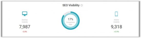
So, it would do you no harm to check SEO Visibility and rankings on various devices, especially in the run-up to Google’s final switchover to mobile indexing for the whole web – for instance with the help of analyses in Searchmetrics Research Cloud:
Conclusion: Act now!
There is not much time left before Google switches to mobile first indexing for the whole web. But it’s still not too late to sort out any issues you might have on your web projects. In order to avoid any nasty surprises, webmasters, SEOs and digital markets should be aiming for a responsive website with identical content of the desktop and mobile versions as well as good mobile performance.
Need some help?
Not ready for mobile first indexing? Get in touch for an obligation free chat about how we can help!