Today, I’m writing about Universal Search. I can’t shake the feeling that Google is strongly pushing the news, images, video and shopping integrations in its ‘normal’ search. At the moment, these snippets seem kind of, well, ‘understated’. To the naked eye, there is little to distinguish them from the organic index, at least with the News OneBox. And the images feel a little HTML5-fluffy, don’t they?
So much for my expertise in graphical matters.
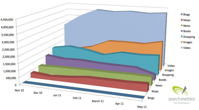
But, I am much better with numbers! So here’s the Searchmetrics graph showing how Universal Search integration has developed in the Google index:
What does this graph tell us? Well, we can see the number of keywords that Searchmetrics has identified with Universal Search OneBoxes and what type of universal search result is popping up the most in the SERPs. Let’s take a closer look at how they compare:
- Videos are the most common, by far – and this figure has only stopped climbing at the start of this year. Why is that? I can only speculate here, but Google is probably eager to send users toward its own products, so what we’re seeing might be due to YouTube data being perfectly optimized for the search index. If someone has another explanation for this, I’m open to suggestions.
- Images took a jump at the start of the year. Surely, this has something generally to do with an image search upgrade and the increased speed at which the images now appear in the index.
- Shopping has stagnated. But since we can safely assume that millions of new products from thousands of shops have been added over the last twelve months, there are only two possible reasons for this. Perhaps the shops are all competing against each other with the same products? Either that, or Google is not so altruistic as to strongly promote their free shopping integration at the cost of AdWords.
- The recently flat maps curve doesn’t match my gut feeling that Google is currently putting a lot of energy into local requests. But then again, there is probably only a limited range of terms that make sense for local results.
- The perfectly flat trend in news results was surprising too. But, this is the nature of the algorithm:news results seem to come before everything else for frequently searched terms and not so much with boring long tail queries. So, what we’re seeing here is not the number of search queries, but the number of keywords with news integrations, which always leans towards the more consistent short tail terms.
- Blogs are not Universal Search’s bread and butter. The way I see it, large blogs appear through news results, while the others bring attention to themselves by different means.
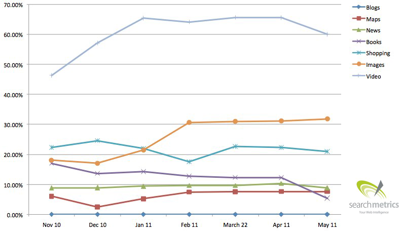
And here again a variation on the above graph with percentage figures for the y-axis:
Videos are 50 percent of all searches? That’s quite high. But, I would still like to know what percentage of search queries have one or more OneBoxes and what percentage of search queries have none. That might be something for a follow-up post…
The strongest websites in the Universal Search
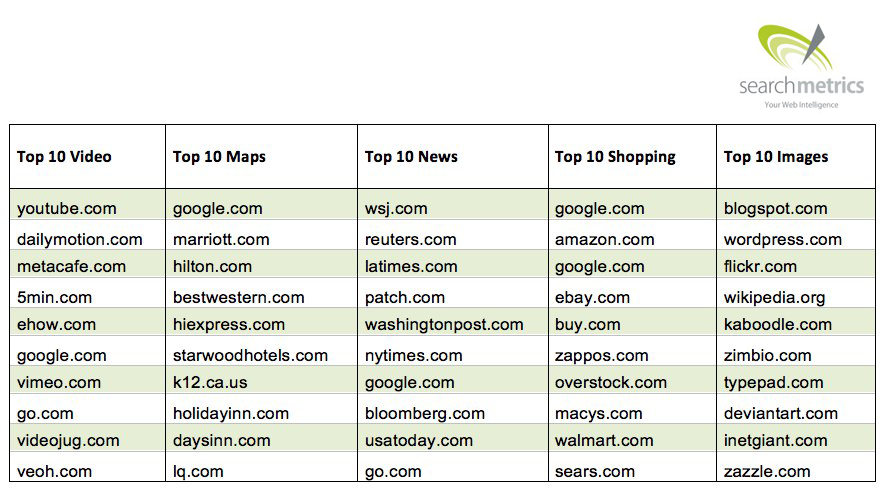
Who is benefiting from these integrations? My colleagues over at Searchmetrics have also listed the sites that appear most frequently in the Universal Search –they include a few surprises. At this point, we should quickly tip our collective hats to the SEOs out there who jumped on the Universal Search trend years ago and are now reaping the benefits. Congratulations guys. 🙂
Nothing too surprising in the videos results. Although, I would have rated vimeo.com higher based on reputation.
Way to go Travel Industry! Almost all of the top 10 websites by map results are dominated by hotel brands. This is a logical fit for the hotel industry, with properties across the US, but what about the big-box stores? The national food chains? It seems that most major retailers do not have their head in the local search game yet while the hotel industry is the clear frontrunner.
WSJ.com is the big shocker in the Google News frontrunners. After the WSJ implemented the “First Click Free” model for Google news, it is surprising to find them at the top when they charge readers for every subsequent story after the website. It maybe shows that while publicly against free content on the internet, they are thinking about SEO just a little bit. We can’t explain this. We can only sit back and watch.
The shopping results are well, predictable. Google appears as a ‘provider’ because the links between the products and the shops, and even deeper in the product search, are somewhat unclear. I would say Macy’s is the one site I did not expect to see, so kudos to the team.
And finally, we come to images. Unsurprisingly, blog aggregators and image sharing sites appear at the top. Technically speaking, their image integration is generally clean, and we know that image optimization does not depend on (sub)domain popularity. Most interesting were the product sites that appeared in the top 10 including zazzle.com, deviantart.com and kaboodle.com, all of which blend social and ecommerce.
So, I hope that I have left enough room in my interpretation for your own thoughts and theories. Please feel free to share your, hopefully, detailed views in the comments.
P.S.: Who’s writing this stuff? My name is Eric Kubitz and I am one of the co-founders of CONTENTmanufaktur GmbH Anyone trying to reach me can do so via e-mail (ek@contentmanufaktur.net) or on Twitter. ‘Til next time!


