The Google Mobile Update, announced at the end of February – Release: April 21, 2015 – makes mobile friendliness a Ranking Factor and means significant effects on rankings in mobile search results. This update is expected to be larger than Panda and Penguin. Websites that are not mobile-friendly are highly vulnerable to losing rankings and massively losing traffic. What does this mean for you and which steps should you take now?
According to Google, the number of Google searches with mobile devices has increased five-fold over the past two years alone. Mobile traffic is continuously growing at the expense of desktop traffic, and Google search queries via mobile devices are already expected to overtake those via PC for the first time this year.
Monitoring Mobile Performance Separately Now Becomes Obligatory
This means it is now urgently necessary to observe your own mobile online visibility, to analyze this separately to the desktop and to follow a mobile-specific strategy! Not only to measure the direct effects of the Google Mobile Update after April 21 on your own content performance, but also to be able to take on long-term monitoring and analysis thereafter.
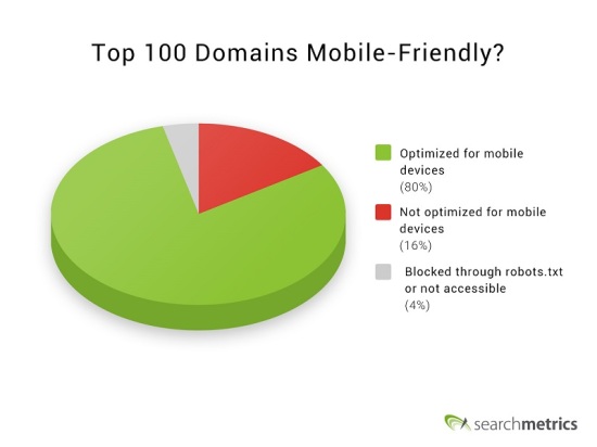
We made an analysis, how many of the top 100 domains (regarding their SEO Visibility) are actually mobile-friendly and used Google’s tool to get the data. Suprising Results! 16 of them are actually not!
What Do I Actually Have to Do Now? 5 Steps for Mobile
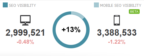
- Measure the difference between your mobile and desktop performance (for example using the Mobile SEO Visibility KPI)
- Track your keywords, rankings and URLS specific to mobile
- Benchmark mobile and desktop against one another to identify ranking differences
- Analyze pages in terms of mobile content optimization (for smartphones. tablets, etc.)
- Mobile page audit: Crawl and check all URLs using various mobile user agents (such as Smartphone, Tablet / iOS, Android etc.) , analyze errors and specifically eliminate them
In our SEO and content software, the Searchmetrics Suite, we offer all of these options for more than 800 search engines/locations/user agent combinations, content optimization and crawling – and do so based on the largest database in the world.
Check your Mobile vs Dektop Visibility to know your mobile Performance and the difference to Desktop. This is a very good indicator to discover problems and potentials.
Enormous Impact on Mobile Searches – Even Bigger than Panda and Penguin
Google has announced that “some big” will happen on April 21. This is something special as Google rarely communicates fixed data and algorithm information so openly in advance. Many people likely underestimate this.
 The last time Google communicated an algorithm adjustment so openly was before the first Panda update (February 2011). Back then, Google was forced to take counter-measures against the rapidly growing number of content farms and had publicly communicated that they would do something about it.
The impact of the mobile update will also be enormous for webmasters in the long term and go along with major disadvantages for non-mobile-optimized webpages, which will go far beyond being branded with the label ‘slow’ or ‘Uses Flash. May not work on your device’, because these websites will simply no longer be ranked in mobile searches.
And that’s why I would like to explain a recapitulation of the latest developments and various data from our analyses of what the update means for the sector.
What Differentiates Mobile from Desktop?
The decisive point here is: The user requirements – the intentions, the requirements of content and the situation in which the searching users find themselves – differ depending on which device is used for surfing.
In simpler terms, you could say: Desktop computers are used primarily for working, tablets for entertainment and media consumption and smartphones spans the breadth of information, news, shopping, social media and entertainment with a primarily private focus right up to apps, the content of which is to undergo a greater focus due to the coming update (buzz word: app indexing).
Why is Mobile (More!) Important?
Google has already decided some time ago to react to the various requirements of mobile users and to adjust its mobile search results to the respective requirements of users with smartphones. Here is a small overview of the most important developments of the past few years:
- 06/2013: Google devalues pages with faulty (mobile) redirects and smartphone-only errors
- 07/2014: Google marks pages in the SERPs that use mobile-unfriendly technologies, which may not work on smartphones, such as Flash.
- 11/2014: Google promotes mobile-friendly pages in the search results, marked with ‘Mobile-friendly’
And now, on February 26, 2015, Google announced their intention to make mobile user-friendliness a ranking factor worldwide.
Mobile-friendly Websites are Favored in Mobile Searches
Let’s summarize: The requirements of smartphone users in internet use differs from those on desktops. Google reacts to this and is increasingly delivering differing search results with the focus on favoring mobile-friendly websites in mobile search results.
On the one hand, this affects the technical performance of a page, in which layout/design aspects also have a role to play. On the other hand, this is related to the website’s content. Here, too, Google has published tips and guidelines, as well as a test with which you can test your page for mobile-friendliness:
- Google mobile-friendly test
- Google guide for mobile devices
Anyone who is interested can find valuable tips about the fundamentals on these pages, but the efficient, individual optimization of content and performance for mobile requirements goes far beyond this.
Search Experience Optimization for Mobile Devices – How To
What should be noted and what should marketers do now so as not to lose track and to optimize their content for mobile searches:
1. Configuration
Not only are the screens of desktop computers and smartphones different sizes – the standard format also differs (horizontal vs portrait). Furthermore, we usually navigate with a mouse on desktops, yet use touch on smartphones. Of course, this has major effects on usability, which should first and foremost be staved off with an adjustment of the design. There are three options here:
- a. Responsive design
- b. Dynamic serving
- c. Separate mobile URL
A tabular overview of the properties and effects of these variations looks like this:
|
Responsive design |
Dynamic serving |
Separate mobile URL |
|
| URL remains the same |
Yes |
Yes |
No |
| HTML remains the same |
Yes |
No |
No |
The use of separate mobile URLs is currently another key reason why mobile vs desktop search results differ so greatly. While a separation of your own content into example.xyz and m.example.xyz allows you to create targeted URLs per end device, this not only doubles your own structure – but it can result in erroneous redirects and a waste of potential (consider your link and site structure).
When using responsive design, however, you have the advantage that both all external signals (backlinks, social signals) and the internal structure can be focused on a target – and yet the content can be specifically played out per user agent (desktop, tablet, smartphone).
This affects both graphics as well as fonts, navigation elements and layouts, etc.
2. Mobile Content and Performance
Content that performs well in desktop searches does not automatically rank well in mobile searches. We were already able to show this in our previous analyses.
Here are some more ways in which mobile differ from desktop search results:
- a. Shorter, yet more holistic content
- b. Quicker loading times than on desktops
- c. Fewer backlinks
- d. Fewer internal links in content
- e. Fewer and smaller images in content
3. Avoid Problems and Bad Usability
In summary, the most common errors in the delivery of content to mobile users are:
- a. Blocked Javascript, CSS and image files
- b. Unavailable content
- c. Faulty redirects
- d. Mobile-specific 404 errors
- e. App download interstitials (user is notified of the app download but prevented from accessing the URLs content)
- f. Irrelevant reciprocal links (in the case of separate mobile URLs)
- g. Slow mobile pages
The usability of mobile users is very clearly the focus. In future, the ‘mobile first’ approach is to be simply prioritized, as the ‘desktop first’ of the past too often resulted in problems for smartphone users.
Conclusion: User Behavior and Search are Changing – Act Proactively!
The current moving of the focus from desktop to mobile is one of the greatest developments of the past few years. In recent times, there has often been talk that mobile will be the next ‘big thing’. Now this is coming to pass. Anyone who is unable to come up with an individual mobile strategy for their content and their website by now will get into trouble sooner or later.
Not only the end devices differ, but also the users, their intention and their situation in which they find themselves when they carry out the search. And so, mobile content must also be adjusted to the requirements of these users.


